If you need to insert data-rich tables on your WordPress site, you can easily find yourself faced with an uncomfortable problem. Considering that the traffic from mobile devices is estimated to be more than 75% (and the data constantly rises), it is essential that even the tables with more columns, therefore wider, are usable and easily accessible even from a smartphone, thus becoming real and own responsive tables.
To better understand the problem, let’s create an example table below using the Gutenberg table block.
| DATO 1 | DATO 2 | DATO 3 | DATO 4 | DATO 5 | DATO 6 | DATO 7 | DATO 8 |
| Valore 1 | Valore 1 | Valore 1 | Valore 1 | Valore 1 | Valore 1 | Valore 1 | Valore 1 |
| Valore 2 | Valore 2 | Valore 2 | Valore 2 | Valore 2 | Valore 2 | Valore 2 | Valore 2 |
| Valore 3 | Valore 3 | Valore 3 | Valore 3 | Valore 3 | Valore 3 | Valore 3 | Valore 3 |
| Valore 4 | Valore 4 | Valore 4 | Valore 4 | Valore 4 | Valore 4 | Valore 4 | Valore 4 |
As you can see, the responsive table generated by Gutenberg is displayed in full on a desktop device, while on a smartphone, if you want to consult the rightmost columns of the table itself, you need to scroll.
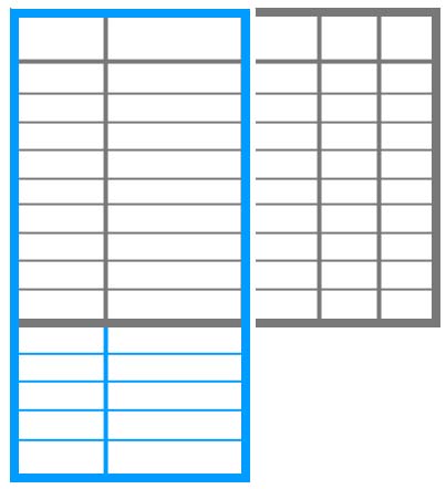
On a smartphone it could be extremely convenient to display the data in a responsive table with a vertical layout, in order to have a first header column with all the data and the subsequent columns with values, as in the following example:
| DATO 1 | Valore 1 | Valore 2 | Valore 3 | Valore 4 |
| DATO 2 | Valore 1 | Valore 2 | Valore 3 | Valore 4 |
| DATO 3 | Valore 1 | Valore 2 | Valore 3 | Valore 4 |
| DATO 4 | Valore 1 | Valore 2 | Valore 3 | Valore 4 |
| DATO 5 | Valore 1 | Valore 2 | Valore 3 | Valore 4 |
| DATO 6 | Valore 1 | Valore 2 | Valore 3 | Valore 4 |
| DATO 7 | Valore 1 | Valore 2 | Valore 3 | Valore 4 |
| DATO 8 | Valore 1 | Valore 2 | Valore 3 | Valore 4 |
In the example just proposed, the responsive table with vertical development was built manually with Gutenberg, simply by inverting the data writing logic. While this is feasible without any problems, such a solution forces us to make a decision which will then produce a completely identical table between desktop and mobile.
The ideal would be instead to be able to have a scenario like this:
- Desktop version: table with horizontal layout;
- Mobile version: table with vertical layout.
This is not possible with the options made available by default by Gutenberg, which is limited in this particular aspect. However, there is a plugin that comes to the rescue.
Is called Make Tables Responsive, and it is a tool that allows you to view tables with different development depending on the device with which you are using them.
The options provided by the plug-in are essential but extremely useful. It is possible to define a break point under which the table is converted (eg on screens less than 651 px).
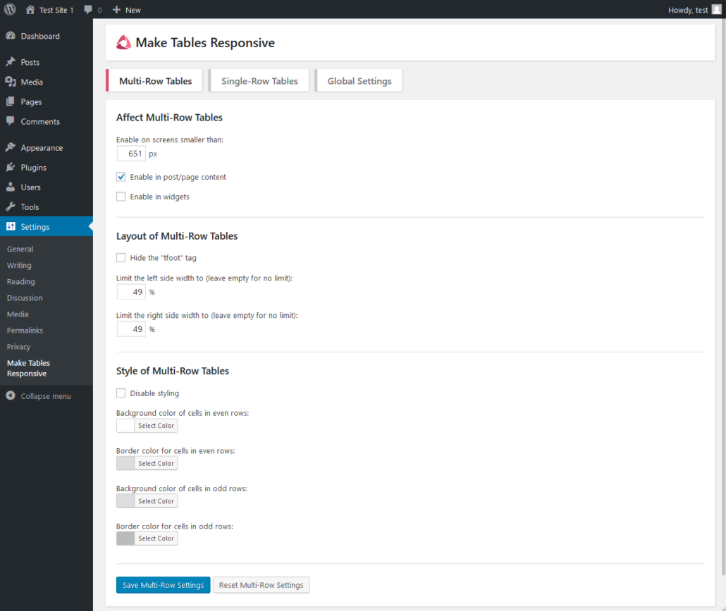
In addition to defining a custom style for the table that is automatically generated, Make Tables Responsive allows you to choose whether to apply the same functionality to any tables present in the WordPress widgets.
In conclusion, this is an excellent solution for creating responsive and mobile-friendly tables.
Ti ho aiutato a risolvere un problema?
Dimostra la tua gratitudine con un piccolo gesto!
Lascia un Commento
Vuoi partecipare alla discussione?Sentitevi liberi di contribuire!